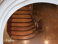
 together it occurred to me that I could have picked a better subject. This one has more things going on with it than I would have liked, but at the same time the lack of color in the final image simplifies things a great deal. Hopefully the idea will still come across clearly enough. (figure 1--Original image)
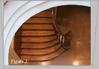
The first thing I knew I wanted to do was crop, but because of the distortions there were no straight lines available to draw a crop from. Or at least not one that I liked. So the first thing I did was select the entire image and use the Photoshop Transform
 command (Edit >> Transform >> Distort) to bend the image and give me some straight lines to work with. (figure 2 -- Transformed)
OK. Thats better. At least now I some straight lines to work with. And in the process I removed an unwanted line as well (the rear section of tiling).
Next, I cropped the image to get the composition I desired.
Now is where the fun stuff comes in. The image was mostly balanced the way I wanted at this
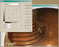
 point, but the color wasn't working for me at all. I was seeing the image in monotone. So knowing that I was going this direction I made what was to be the first of many selections to manipulate the overall tones. (Figure 3 -- Crop and Initial Selection, Please forgive me for covering both with one image!)
As you can see, I made a selection of the tiling with the Lasso tool, and modified it with a mild tone curve. Next, and this has become one of my favorite tricks, I used the Invert command (Select >> Invert) to select the other half of the image. Then I modify it with a reverse of the previous curve. The trick is making good selections that Feather enough and/or follow existing lines of light and shadow so that you don't notice the transition zones.
The basic technique is nothing new, of course. It's really just the digital equivalent of dodging and burning using selections made with the Lasso tool. But with digital you can also use your selections to do lot more than dodge and burn. If I want to manipulate the color in an area, or the saturation, the sharpness.... whatever, it's all right there, just waiting to be adjusted.
Now, you could easily do something similar and make it even better (less destructive to the image) by working in layers. I typically choose not to because I dislike layers, but that's just a personal preference thing.
For the final image I did several more things. So many that I don't recall them all. But it includes
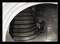
 everything mentioned above, along with a conversion to black and white that was later given a sepia tone. I also added a bit of grain.
From the original to the finished piece the individual changes were very subtle, but when taken as a whole they tend to add up.

5 comments:
AMAZING lines and love the instruction of how you went about this as well. I really like the BW even more than the color. Very nice detailed info too!
Thanks for all your instructions. I CAN'T WAIT to get photoshop. yes I know, "gasp!! You don't have photoshop??" I'm working on it. trying to get some of my photos to sell so they can pay for it.. lol
anyhow great and informative post as usual.. Thanks
Do you imagine that the architect imagined that the steps would mirror the flow of the arch? Do you imagine that s/he imagined that the texture would contrast with the framing?
While I imagine that was what was imagined, I think that you've completed the thought.
Its worrying me that I'm drifting so far away from these sort of powerful basics into an over-processed result. As you say, there were probably too many steps to describe in reaching your final result. But what's cool is that they are invisible. You've got an organic quality in this result which goes beyond, yet explains the original intent.
Sigh.... gotta get back to that... Gotta....
Thanks Michael... Almost Zen....
Ted
Thx for the comments everyone. It was not easy to put these past few posts together, and I certainly wouldn't want to try and do this kind of thing all the time. Still, it was fun. And as long as someone out there gets something out of it... well, that kinda makes it all worthwhile.
Michael,
Sorry when I don't chime in, but for me this is not yet done. I have a problem with the wall left of the stairs, under the arch.
There is a bit of dark panelling coming down the stairs, white wall above, and then the lighter panelling of the corner. The problem is, that there are considerable contrasts and wild angles in this place, and none of that gets resolved.
I have tried two things: first was simply extending the steps to the left, under the arch, pretending the stairs were much broader. It resolved the conflict, but for the price of making the staircase look plump and uninteresting. No way to go.
The second attempt was better. I simply extended the dark panelling, making it cover the whole range under the arch. That did the trick.
Another possibility would be to extend the arch, let it curl in at the bottom, and this way making the whole thing look more like a spiral. That's hard for two reasons: First, there is probably not enough material on the left to clone from, and second, humans have a pretty precise vision of what an aesthetically pleasing spiral looks like. Maybe it would work, maybe not, maybe we would have to stretch the image vertically, in any case we would reach a point where not much of the original image would be left. A possible route, but I think extending the dark panel does the job at a much lower price.
Post a Comment