Monday, March 31, 2008

Down Time

As far as proper photo "taking" goes, I have been on extended leave. Call it "down-time," if you will. I stopped carrying my point and shoot as a matter of habit back in December, and I have been using various excuses NOT to carry ANY camera into the outdoors of late. And while I'm not sure what it all means, I am cognizant of the fact that I'm doing it.

Admittedly, I have been concentrating on hunting morel mushrooms the past few weeks. So far, though, no luck. In fact, I'm about to consider this year a bust and focus on looking for better sites to search next year. I say this, despite the fact that I just plopped down a not insubstantial sum of money for a shiny new Garmin GPS, an Etrex Venture HC, just in case I did (do) find a morel. Then at least, I would know where to look next year.

None of this, of course, is any excuse for venturing into the forest camera-less, and that is exactly what I have found myself doing.

This week I offer up another old image (goodness I'm tired of saying that) that was taken back in December. It showed up on my drive as a horizontal, but I think it works much better as a vertical. In any case, I guess it's better than nothing at all.

Monday, March 24, 2008

Steps

The image I chose to work with for this demostration is an old one. It was shot from the balcony of the second floor in the Old Arkansas Statehouse. And after working with it to put this post together it occurred to me that I could have picked a better subject. This one has more things going on with it than I would have liked, but at the same time the lack of color in the final image simplifies things a great deal. Hopefully the idea will still come across clearly enough. (figure 1--Original image)

The first thing I knew I wanted to do was crop, but because of the distortions there were no straight lines available to draw a crop from. Or at least not one that I liked. So the first thing I did was select the entire image and use the Photoshop Transform command (Edit >> Transform >> Distort) to bend the image and give me some straight lines to work with. (figure 2 -- Transformed)

OK. Thats better. At least now I some straight lines to work with. And in the process I removed an unwanted line as well (the rear section of tiling).

Next, I cropped the image to get the composition I desired.

Now is where the fun stuff comes in. The image was mostly balanced the way I wanted at this point, but the color wasn't working for me at all. I was seeing the image in monotone. So knowing that I was going this direction I made what was to be the first of many selections to manipulate the overall tones. (Figure 3 -- Crop and Initial Selection, Please forgive me for covering both with one image!)

As you can see, I made a selection of the tiling with the Lasso tool, and modified it with a mild tone curve. Next, and this has become one of my favorite tricks, I used the Invert command (Select >> Invert) to select the other half of the image. Then I modify it with a reverse of the previous curve. The trick is making good selections that Feather enough and/or follow existing lines of light and shadow so that you don't notice the transition zones.

The basic technique is nothing new, of course. It's really just the digital equivalent of dodging and burning using selections made with the Lasso tool. But with digital you can also use your selections to do lot more than dodge and burn. If I want to manipulate the color in an area, or the saturation, the sharpness.... whatever, it's all right there, just waiting to be adjusted.

Now, you could easily do something similar and make it even better (less destructive to the image) by working in layers. I typically choose not to because I dislike layers, but that's just a personal preference thing.

For the final image I did several more things. So many that I don't recall them all. But it includes everything mentioned above, along with a conversion to black and white that was later given a sepia tone. I also added a bit of grain.

From the original to the finished piece the individual changes were very subtle, but when taken as a whole they tend to add up.

Monday, March 17, 2008

A Picture in a Box

Explaining ones personal approach to composition, even to fellow artists, is always a difficult proposition. I believe most everyone learns the so-called compositional rules--the "rule of thirds," how to recognize and direct "leading lines," image balance, and any number of other esoteric descriptions that can be used to sum up what is essentially a picture in a box, if only so we can break them later.

But it's in the way we incorporate these elements into our work once we have an understanding of the "rules" that things begin to get interesting. This is where style comes in, because I believe no two people will see and compose things in exactly the same way, for all the same reasons. They may end up with results so similar as to make it pointless to dissect the differences, but the approach, the journey, and the motivations, will always be somewhat unique.

In fact, one of the most beautiful things about composition is that you need not know a thing about formal compositional techniques in order to be able to do it well. Some people, it seems, just get it right.

I am not one of those people. I have to work at it to make something happen. (I try to get what I want while framing with the camera, but it almost always takes some fine tuning in Photoshop to get it just right.) The only ideas I try to keep in mind as I'm cropping are how I can bring a sense of balance and order to the composition, and how will the cropping affect the amount of depth (or perceived depth) in the finished product.

That's it.

By keeping the formula simple I like to think I'm keeping the possibilities open. And, as corny as it sounds, I try to listen to the image, to visualize the finished product before I even start working with it. The idea being that if I can understand where an image wants to be, then maybe I can help it get there.

Over the years I have developed a few tricks and techniques to make my visualizations as complete as they can be. Next week I'll share one of my favorites--Selections and selective tonal manipulations.

Monday, March 10, 2008

Composition, Cropping, and Intended Usage

The original idea was to babble on about the kinds of thoughts and ideas that go through my head as try and frame up an image. So here goes:

Does this make sense? Might it look cool from this angle? Would it be better with more or less DOF; and do I even have the light to experiment? Have I seen this kind of image somewhere before? Will this light translate into anything like what I'm thinking once I begin to process it? Is this shot even worth pulling out the camera for? And if I do, I'll look like such a dork... taking a photo of this puddle here in the middle of the street. But then again, who cares? I am a dork. I might as well be a photo taking dork. So take the photo already. Should I bother with a tripod? Maybe I can get away with bracing up against this pole with a beanbag. Should I include some figures in the scene? Maybe if I use a long exposure... What's the lowest ISO I can get away with? And how many shots are left on this card?

These are but a few of the fleeting thoughts that occur to me often as I photograph. Not all of them, all the time, of course, but you get the idea.

Over the years, though, I have come to discover that these questions often end up meaning very little to my final product. I seem to do better if I take LOTS of images to work with and crop thoughtfully later, depending on how I plan to use the image. We get lots of megapixels to work with these days, so we might as well make the most of them.

I still recall how utterly astounded I was after cropping and printing some 11x17 images from a good friend's 8mp point and shoot. I was used to the quality of output from my 6mp DSLR, and initially felt his desire for 11x17 from an 8mp digicam was a real stretch. I wasn't expecting much. Besides, his images were JPEG's, and was used to working with RAW. But I cropped and sized and printed them... and wow! I wasn't used to JPEG's looking so good. And I never would have thought that the 2 extra megapixels on a point and shoot would add anything much to an image. I was wrong.

Those 2mp allowed me to crop just enough for a good composition and still have the image size available for a very large print. One that, quite frankly, looks just awesome. And I can't even take credit for it! All I did was prep it.

None of this would have meant much, though, if I had not been planning on printing it so large. And that, really, is the whole point:

Crop to get the composition you want, not the file size you think you may one day need.

This is probably the best approach to take when cropping, but I don't always follow it. I have a tendency to try and retain the largest file size regardless of how the image is likely to be used. Sometimes, at the expense of what would be a better composition. And, yes, we may want the big print (and need the big file) every once in a while, but it makes no sense to crop images based on preserving a larger file size unless we know we are going to be printing it big.

These are all subjective observations based on my own experience, of course, but really, they seem to hold up in that eyes of almost all non-photographers. I have found that very few photo viewers, who are not also photographers, care anything at ALL about file size, file quality, sharpening, or any of the other stuff we work so hard in Photoshop to create or maintain. They look at the photo, be it a web image or a large print, and get an impression based only on what they see:

Composition, Color, and Clarity.

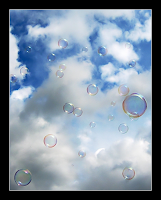
Photo viewers who know nothing else about an image (such as who or what the subject is, for instance) will respond to the image based only on these three criteria. Besides, if they don't recognize a subject, such as Mom, uncle George, or a Ferrarri F430, what else have they got to go on?

I wanted to discuss my thoughts on compositions first because I have always thought they carried the most weight. Next week I'll babble about what I look for in my compositions and try to explain a little bit about why I make the selections I make.

Now, about the images.

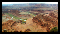
The first example above is not my own work. It's the web version of the 8mp image I printed for a friend showing the famous gooseneck of the Colorado River at Dead Horse Point. The second image is a DEEP crop from a 3mp image that has been Photoshop'd to the point of begging for mercy, but it still makes what I think is a nice web image. Mostly due to its unique composition. It would probably not make a very good print, even in the 8x10 size.

(Incidentally, it was the first image that sold me on going out west to Utah with my friend last year. I mean, who could resist that?)

Monday, March 3, 2008

Trinity


If you come from anywhere in the South, especially someplace in or around Louisiana, then you probably know what the Cajun Cooking Trinity is all about--Celery, Onions, and Bell Pepper. Yum-Yum.

I hail from south Arkansas, not 30 minutes from the Louisiana state line, so this vegetable trinity has been a constant throughout my life. I don't use many of the meat ingredients common to Cajun cuisine (shrimp, crawdads, blood sausage, etc...) but I do use the Trinity in a large number of the dishes I prepare. As far as I'm concerned, some things, soups and stews, for instance, just aren't done right unless these ingredients are in there. And if I don't I have them fresh, then I'm not afraid to use them dried. Doesn't matter, really, as long as they are in there.

Today's post, however, isn't really about cooking with the beloved vegetable Trinity of Southern Louisiana, it's about my own Digital Image Processing Trinity--Composition, Color/Tone, and Sharpness.

I fell into using this triplet before I was even shooting digital, because this was the method I used for tweaking scans from slide film. Digital just made it easier, not to mention more fun.

Over the past 10 years or so (it was about that long ago when I began working with digital scans) I have developed a good many techniques for image processing that not only suit my style, but please my senses as well. And if I'm not happy with an image, then no one else is ever gonna see it.

Starting next week I'll begin, in some detail, to break down the processes I go through with image making. Not that I feel I have anything new or better to say than anyone else, but just because it seems like a fun thing to do.

As for todays image, it's a real oldie. In fact, this was the shot that ended my use of film forever. back then I didn't know a thing about printing from a "pure" digital image. I was used to seeing at least some film grain, even in my smallest prints, but this image, born of a tiny digicam and printed from an aging HP printer changed all that. From 3.2mp the resulting 8x10 was amazing. Not that the image was that great, it's not, but the print was so colorful, so pure, so EASY. I had done it all by myself, and it was unlike anything I had ever created before. No more film for me.